Hello and welcome back friends and if this is your first time here you are in for a real treat! What treat is this I speak of? Well… I’m dipping my toes into a fun new Design series – myself and 3 other design friends are creating high/low mood boards for your inspiration. We wanted to share how we take bits and pieces from a room, even if something isn’t completely your style 100%. You can take elements you love from a room and build it to suit your tastes and that ever present budget! Ugh. You can create a lovely space for less and we will show you how we would do it. There are so many different styles out there (read overwhelming), so many combinations (oh my stars – I want all of it) and I’m super excited to see what my mega talented friends have come up with for our new, High/Low series. Let me introduce you to my buds, I’m a little obsessed with them (in a Non-creepy way of course), make sure to check out their high/low rooms, I know I can’t wait to see all of the details!
Andrea over at Harlow & Thistle
Thalita over at The Learner Observer
Bethany over at This Little Estate
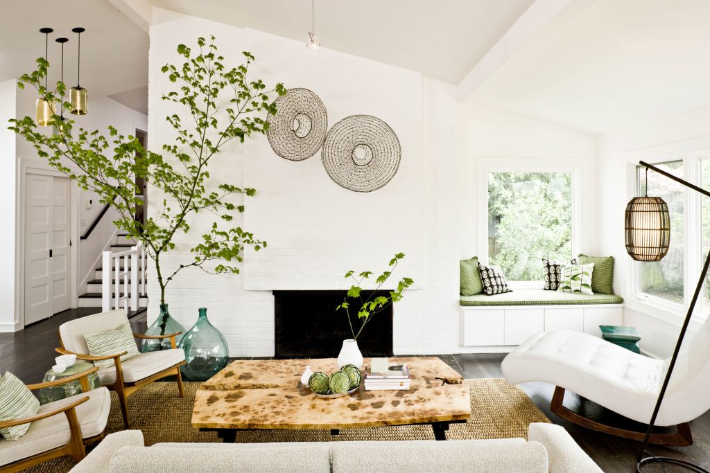
MCM inspired room
I’m super excited like I said above to be flexing some design chops, for those of you that don’t know I am a trained Interior designer… I’ve actually been in the world of corporate design for the last 17 years and in the corporate world there is not a lot of creativity (understatement), at least not the kind that makes me giddy like this does! So, having said that this is a new to me exercise, because of the corporate world I’ve been in and frankly I’m a thrifter (that sounds like a bad country song) I LIVE for a good deal, the hunt for something is like a drug for me, hahaha. Am I sharing too much info here, maybe. I guess what I want to make clear is this shopping for brands is kinda new to me. Shocking and sacrilege to most designers, I know. If you need a good specification on a high wear porcelain tile, I’m your girl. hahaha But seriously, I’ve been in love with the more creative side of design since the beginning and this new series is right up my creative alley and I get to learn – win win!
MCM – Mid-Century Modern isn’t exactly my style, don’t get me wrong, I love the look and the feel, it just doesn’t “belong” to me. Do you know what I mean? Why did I choose this image then, well I am a huge fan of taking elements of design that I do love and creating a space. The designer of this room has called it Mid-Century modern and she focused on bringing the outside in giving this room a more open feeling because of the small size. What caught my eye about this space is all that gorgeous texture, the neutral backdrop, the contrast of the dark and the light and that lovely green! Swoon!
Without further delay, here are the mood boards I created, let me know what design elements you think I was drawn to and what board do you prefer? Or are you a combo kinda person?
High cost mood board
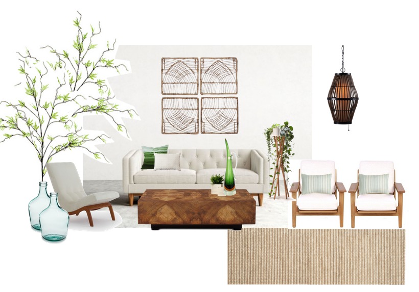 Ah the gorgeous pops of green on that stunning neutral backdrop and that lovely warm texture, and I HAVE to DIY that plant stand! And that coffee table, YES please! What do you like best in this board?
Low cost mood board
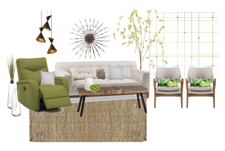 Okay, stop everything, that wallpaper is making me so happy! I mean, come on! Those lights too, delish! And the pop of green in that reclining chair, I could not resist it although typically I don’t care for a recliner type of chair, I’ll make an exception to my silly rule with this one. My fave is the drama created with the darker lights and the wall medallion. And the wallpaper adds the perfect ode to MCM in my opinion. What do you like in this board? Below is a breakdown for you, I must admit I would be influenced by the cost if I were to put this room together, for sure. Sometimes what I like to do when designing a room is pick a higher end focal and work off of that in the lower room the lighting really caught my eye and would be my higher end focal piece.
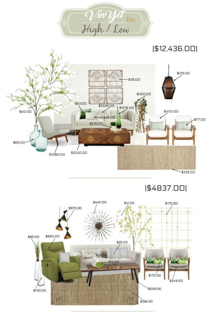
Cost difference at a glance
Nuts right? The cost of some things is bananas!
For more fun and inspiration…
Follow us on Instagram:
The Learner Observer – Thalita
You’ll also want to check out this hashtag, #highlowshow on Insta. Trust me you don’t want to miss all of the design eye candy that is sure to follow!
Thanks so much for stopping in, I hope you like this new High/Low show as much as we do! You can find the complete shopping guide for both looks below, happy shopping! I’m after that wall paper for a little camper project! Yay!
Complete shopping guide
335 CAD – overstock.com
215 CAD – kirklands.com
210 CAD – domino.com
19 CAD – zulily.com
38 CAD – target.com
77 CAD – neimanmarcus.com
47 CAD – target.com
1,015 CAD – chairish.com
63 CAD – nordstrom.com
2,485 CAD – roveconcepts.com
3,240 CAD – neimanmarcus.com
1,410 CAD – roveconcepts.com
1,080 CAD – joybird.com
450 CAD – crowdyhouse.com
975 CAD – zincdoor.com
amazon.com
440 CAD – chairish.com
170 CAD – 1stdibs.com
170 CAD – domino.com
130 CAD – 2modern.com
85 CAD – overstock.com
32 CAD – target.com
25 CAD – belk.com
12 CAD – macys.com
12 CAD – pier1.com
890 CAD – jcpenney.com



3 Comments
Speaking of thrifting, I saw a big green glass jug at the Salvation Army, like the blue ones in your first mood board. It didn’t have a price on it and I was trying to be good and not add to the overabundance of stuff around here, so I passed it up. And now I kick myself whenever I see pictures of similar ones. (Just kicked myself – twice – haha.) This is a fun series – I love a good high/low. I can’t see converting to Mid-Century Modern now, but I do really love the look. Both of your mood boards are beautiful!
I love mid-century modern! I’m surprised it’s not your favourite style because you’re so good at it. You did an amazing job!
I love how you included the shopping guide at the end of your post! I want it all!!! Now, where to find a spot for everything! 😉